
Ten Most vs Ten Least Vaccinated Countries and How They Are Doing
Ten Most vs Ten Least Vaccinated Countries and How They Are Doing
Let's See If We Can See a Difference In Death Rate With Vaccination Rate

2/8/2022: Data as of 2/3/2022
Sorry this has taken so long, but times have been busy and there was some data to compile for this comparison.
OK, I am writing this before I perform this exercise. This is the exercise. I will look at the ten most vaccinated countries in the world according to data and compare them with the ten least vaccinated countries in the world. I will not be using China and Cuba for two reasons. First, I don’t trust those governments’ data at all and secondly, they did not use the mRNA/adenovirus vaccines that we used here.
The ten most vaccinated that fit are UAE, Portugal, Chile, Singapore, South Korea, Spain, Denmark, Cambodia, Canada, and Japan. I am surprised Israel is not on this list. The ten least vaccinated countries are Burundi, Congo, Haiti, Chad, Yemen, Ethiopia, South Sudan, Cameroon, Papua New Guinea, and Nigeria. I also did Madagascar and added it to the list because it is a country I like and it is an island (island countries have had different trends with Covid).
Now before I do this exercise, it should be pointed out that the richer more vaccinated countries probably have more testing and more accurate numbers with both cases and deaths. I will be looking at three periods in time. The first period is from 3/15/2020 to 3/15/2021. This period is straight unvaccinated for all. I know that some countries started their vaccine campaigns in January and February in 2021, but they were not really moving. March is about when most countries had a decent number of citizens vaccinated. I had to set a date for the “unvaccinated” time period and March to March seemed to work. The next period is the “vaccinated” period. This is the time when you think cases and deaths should go down if a large percentage of people were vaccinated. The last time period is the Omicron time period. I stared Omicron at 12/15/2021. This period goes from then to current, 2/3/2022 for data end point.
I also looked at cases in the pre-Omicron and post-Omicron periods to see what effect Omicron had on cases based on vaccination status.
Here are the countries with their daily new case data:
#1 UAE 93.1%, 43.7%

#2 Portugal 90.5%, 51.3%

#3 Chile 88.2%, 66.6%

#4 Singapore 87.8%, 57.9%

#5 South Korea 85.8%, 53.2%

#6 Spain 81.9%, 47.3%

#7 Denmark 81.4%, 61.6%

#8 Cambodia 81.2%, 36.3%

#9 Canada 79.3%, 415%

#10 Japan 79.2%, 4.4%

Least
#1 Burundi 0.05%

#2 Congo 0.23%

#3 Haiti 0.69%

#4 Chad 0.8%

#5 Yemen 1.13%

#6 Ethiopia 1.36%

#7 South Sudan 2.18%

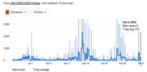
#8 Cameroon 2.44%
#9 Papua New Guinea 2.53%

#10 Nigeria 2.58%

#11 Madagascar 2.7%

This table below shows the following data from my exercise. Percent vaccinated a country is and percent boosted if applicable. Then the populations of the countries. The next column is how daily new cases are faring in their country, declining, increasing, flat, or too low to determine. The next two columns are the peak in daily new cases post-Omicron and pre-Omicron 7-day rolling average, they indicate the average new case peak on the peak after 12/15/2021 and the peak before said date. If a country was currently rising, it was the new case peak 7-day average for 2/3/2022. The next column is the Case Peak comparison. This is the ratio expressed as a percent, this means 100% would be the same peak before and after Omicron. For example South Korea ratio 801% in daily new cases. In this case of new cases they had just over 7 times as many daily new cases at their Omicron peak compared to the peak of daily new cases before Omicron. I then looked at deaths per day per 10 million people on average in the three time periods. To calculate this I had to put the total Covid deaths on 3/15/2021, 12/15/2021, and 2/3/2022. The first period is just the total deaths on 3/15/2021. The second period is 12/15/2021 minus 3/15/2021. The last period is 2/3/2022 minus 12/15/2021. Then I divided by the number of days in the sample and the population. This gives average daily deaths per capita in these time periods.

Here is what the data indicates. Daily new case peaks were about 3.5 times higher in the vaccinated countries and not even double in the unvaccinated countries. I do agree that cases were probably not counted nearly as accurately in the poorer less vaccinated countries. However, presumably each country counted a case the same way through the pandemic. More readily available testing may have increased cases as well. With the exception of UAE and Cambodia, every vaccinated country got crushed with Omicron cases.
The daily death per capita is the most extraordinary information. In the vaccinated countries the average daily death per capita seemed to go down after the vax campaign, although in only half of the countries. I don’t know how much I trust the data out of Cambodia, but the other nine countries should be reliable. Japan seems to be doing the best post-Omicron, but they are also not boosting and there is debate over whether Japan is using Ivermectin in the fight against Covid. Only Madagascar (a country that doesn’t qualify) had an increase in per capita Covid death after Omicron showed up among the unvaxxed countries.
I know the post-Omicron sample does not have a huge number of days, but Portugal deaths are up over 250%, Spain is up almost 100%, Denmark has a 6 fold increase in daily Covid deaths. Canada is up over 200%. South Korea, though a low start, is up over 300%.
Look at the cases in the vaxxed countries: 6 increasing, 3 decreasing and one too low to determine and that is Cambodia. Compare them to the unvaxxed countries and only one country is increasing and it is Papua New Guinea and that is increasing from a near zero number of cases. On average the vaccinated countries have peaks 3.6 times higher after Omicron compared to before Omicron.
The daily deaths per capita are higher in Singapore, South Korea, Denmark, and Canada after Omicron than before the vaccine existed. This is with these country’s’ medical institutions knowing more how to treat patients with Covid. Six of the vaccinated countries are still rising in cases. This will unfortunately and sadly lead to more Covid losses in those countries.
How can anyone look at this data that was found on Google and think that these vaccines are a good idea. You don’t even have to look at the unvaxxed countries for comparison. Omicron doesn’t look as mild in the vaccinated countries.
I would be very interested to see rates per country of prophylaxis for MALARIA use vs Covid IFR. HCQ and other drugs are well-suited as anti-malarials and, well, you know what else.
This is interesting, but I don't find it very compelling - seems like too many confounders have been ignored to really draw any good comparisions. It seems just as reasonable to assert that population demographic difference expain the difference. Seems like a lot of the no-vax countries are 'hot' climate locales vs high vax countries with more seasonal variations too.